What is desirable, trendy and popular is constantly changing. That is why we have to be up to date with the trends in the publishing industry today.
Here are some of the trends we like to follow and pay attention to when designing a cover:
A Stylized Typography
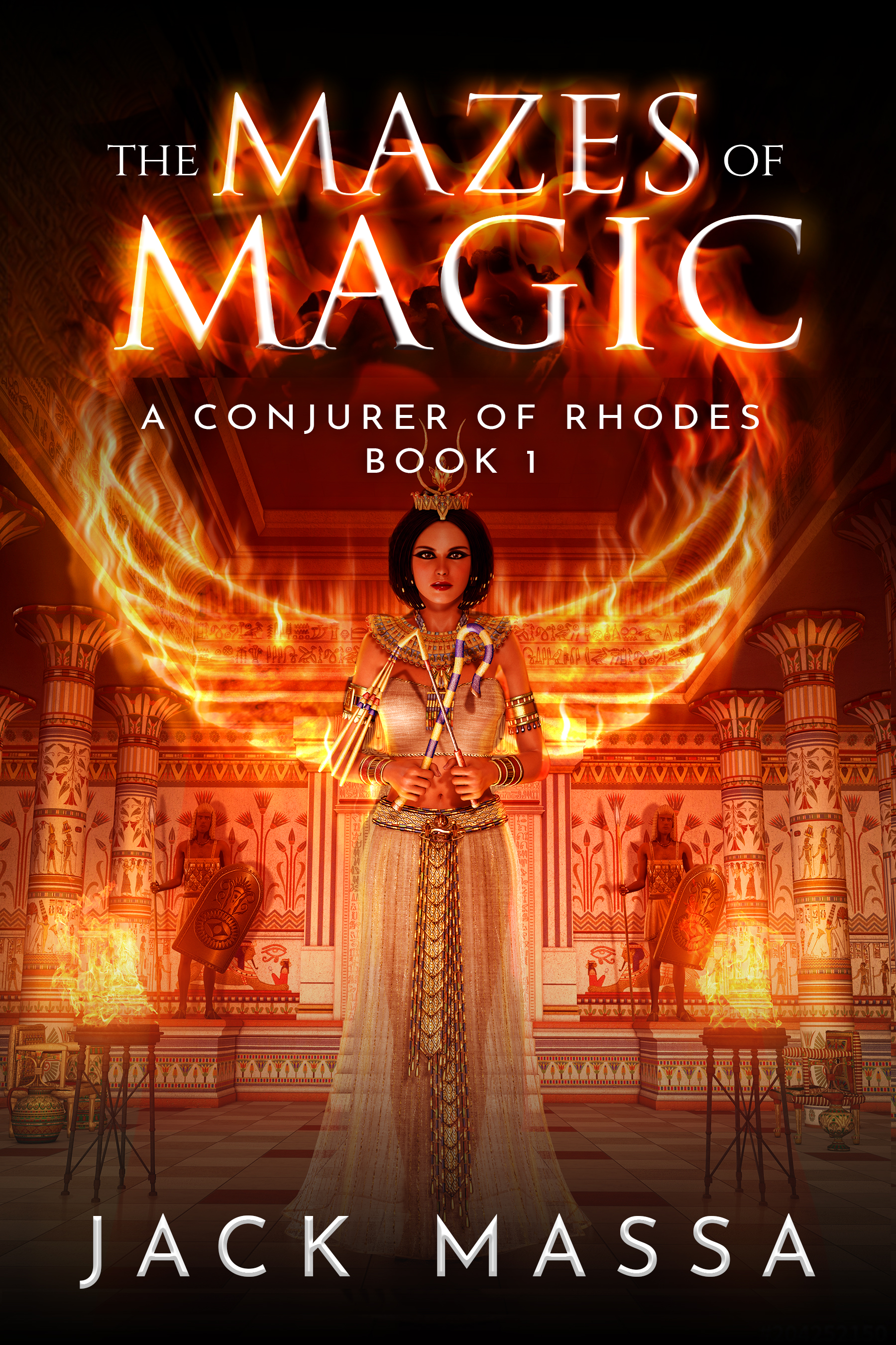
The font that you are using can also say a lot about what your book is about, as well as the selection of your background image. There are a lot of big, clear, sans-serif fonts used on thriller, mystery, crime book covers nowadays, but we also like to play with the font if we get a fantasy or a Science Fiction novel that needs a new cover.
Breaking the letters of a certain typography, playing around with them on the artboard and making it magical and mysterious is our favourite part of book design. And, of course, we are always being careful about not getting too carried away and end up with sloppy and tacky book title design.
Layers, Frames and Patterns
We want our author’s book covers to stand out among a sea of other books online.
So, if we feel the cover is too plain and simple, we like to add more layers to it by using different images with patterns on it, frames that would serve as that “perfect design touch”.
 Magical Colors
As in terms of colours, we tend to not mix more than two, or in rare cases three colours. We like it simple, but also gorgeous and rich, so we tend to use colours that draw attention such as red and yellow, or captivating like purple and turquoise for Fantasy and Science Fiction covers. We are always sure not to overdo it, as the tile of the books should remain clean and readable.
If we have a lot of going on in the background image, the typography we use is going to be clear and simple. If they don’t have much going on in the back image, we are going to emphasize the title will full and interesting looking typography.
 Say it or Show it
A timeless rule. We will either send a message with the background design we make, or we will say it with typography. Never both. Meaning, we are never too literal with our designs.
The worst you can see is the title literally mirroring what is happening in the background. we don’t want to underestimate our readers and we want to be a little mysterious as well. We communicate with our authors to decide what setting and which character we should depict on the front cover. Also, a human element is a must have.
Even if it’s just the back or face, but it certainly captures the attention more than just to have a dead object such as a house, a piece of furniture etc.
See our Magazine here!
See our work and sign up for a book cover design here!


